![White logo TopLeft_240x78.png]](https://help.topleft.team/hs-fs/hubfs/White%20logo%20TopLeft_240x78.png?height=50&name=White%20logo%20TopLeft_240x78.png)
This document describes TopLeft's older UI. We recommend you use our new UI, which has new visualizations, better performance, and more flexibility.
A TopLeft Kanban board displays a selection of tickets, projects, or opportunities as cards in a series of columns. The cards are selected using flexible filters- for example, filtering on ticket technicians, company, project, or priority- allowing you to configure a board to show almost any collection of tickets you can think of. Columns are mapped to ticket, project, or opportunity statuses. Columns display cards that match both the Kanban board filters and the statuses mapped to the columns.
Cards are ranked with a priority; cards appearing first in a column are considered a higher priority than those at the bottom of a column. As work progresses through the PSA workflows, the cards move from left to right through the series of columns. If a ticket becomes blocked or needs to be re-worked for any reason, it will move right to left, indicating waste.
Boards are automatically refreshed every 30 seconds to always show the most recent data.
Kanban boards are made up of three parts:
- Menu and header
- Columns showing lists of cards
- Cards, which represent one of several types of records.
Header
The menu and header section allows navigation between boards, shows information about a board and applied filters and offers user profile controls.

From the above image, the parts of the header are:
- Board menu, offering links to each TopLeft board.
- Profile link, opening the style profile page (ConnectWise only).
- Board name and edit function. Boards can be edited by administrators.
- Filter button, opening a dialog to apply filters to a board view. Unlike the filters applied on the board editing page, these filters are temporary and are only visible to the user that selects them.
- Help menu, with links to the knowledge base, customer support, service status, and more.
- PSA menu, to quickly create tickets, opportunities, projects and activities in your PSA.
- Admin link, opening the settings page for administrators.
- Announcements from TopLeft- if it is red there are new announcements
- User profile menu, which has links for account options and logging out.
Columns
Columns display prioritized lists of cards. They can be split into horizontal rows called "swimlanes."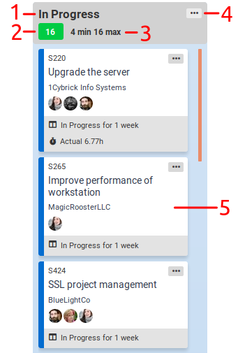
From the above image, the parts of a column are:
- Column name
- Number of cards in the column
- Work in progress (WIP) limit indicator. WIP limits advise the acceptable number of tickets in a column. If the number of cards is within the acceptable range, the indicator is shown in green. If the number of cards is outside the WIP limits, it is shown in red. WIP limits are optional.
- Column menu:
- Expand: shows a large view with only the cards in that column. This can be useful for getting a view of all the cards in a column when there are a lot of cards.
- Show Mapped Statuses/Stages: shows statuses mapped to the column
- Card
When there are too many columns to show at once given the width of the browser window, a horizontal scrollbar appears at the bottom of the window, so you can scroll to the right to see all the columns.